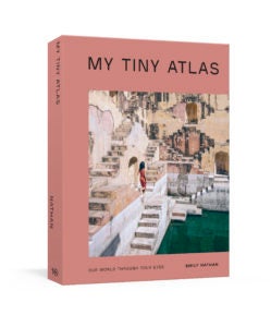
TSP’s Lizzie Allen Takes Us Behind the Design of MY TINY ATLAS
 Now that spring is here, got the travel bug? Then you may want to check out Emily Nathan’s MY TINY ATLAS: Our World Through Your Eyes, newly published by Ten Speed Press. This book is a stunning visual feast of creative photography and inventive design, with a wanderlust-inspiring and transporting collection of images showing some of the world’s most astounding places. As tour guide, the founder of Tiny Atlas Quarterly—one of the most trusted sources for authentic and inspiring travel photography— takes readers to all corners of the world, from Paris, San Francisco, London, and Buenos Aires to the Arctic Circle, Tanzania, Tahiti, and Mongolia. MY TINY ATLAS visually explores new destinations with an intimate, insider’s view—not of the usual monuments and tourist attractions, but of real people, verdant flora, wild animals, architectural gems, and other details that make you feel what it’s like to truly be in another place.
In this “Behind the Design of Our Books” interview, Ten Speed Press Senior Designer Lizzie Allen pulls back the curtain on the process involved in creating this unique volume. She talks about the one-of-a-kind design of the cover, working closely with the author as the interior pages came into view, and what you will discover as you plan (or dream about) your next vacation.
 What inspired your design concepts, unique book presentation, and the overall format of MY TINY ATLAS?
We wanted MY TINY ATLAS to be intimate and stand alone as a physical object. The book’s acquiring editor had the idea for the unique format of a French-folded jacket over a paperback cover. To make it even more tactile, we used a textured paper for the jacket and hit the text on the cover with spot gloss. The jacket folds out to be almost poster-like, and the inside of the jacket is printed with a wallpaper-like pattern that was illustrated by a friend of the author.
How involved was the author in the design process, and how did you order and weave together the stunning blend of text, photos, and captions?
The author was very involved—it was an incredibly collaborative process. She determined how the sections were broken down—afloat, electric, wild, curious, etc. — and grouped hundreds of images into these categories. Then, I selected images for each page. When pairing images, I paid attention to the color, subject matter, texture, and perspective of the photo to create pleasing spreads. The author worked with me to nail down these selections, reordering where necessary. Captions were then placed to fit into the design.
Who do you feel will be most attracted to this book and what elements of MY TINY ATLAS do you think will resonate most strongly with readers?
This book is for anyone who loves to travel and explore! It’s a travel guide for photography enthusiasts and armchair travelers, and is full of beautiful images from locations all over the world—it will definitely inspire people to plan a trip. It contains insider information on how to access some hidden gems, and how to be respectful of seldom-visited places. The millions of fans of Tiny Atlas Quarterly, who have tagged their images on Instagram with #mytinyatlas, will love this book. MY TINY ATLAS is ultimately all about a community who loves and celebrates travel.
