Behind the Book Covers with Knopf’s Chip Kidd
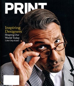
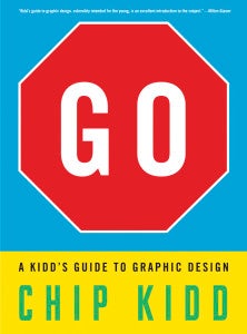
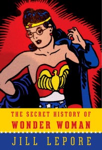
 Chip Kidd, Associate Director, Art and Cover Design, Knopf Doubleday, was heralded as “The Superhero” by PRINT magazine and featured on the cover of the publication’s Spring 2016 edition, honoring “56 Inspiring Designers Shaping Our World Today.” Beloved and admired throughout our company and the entire publishing industry, Chip was hired as assistant to the Art Director of Alfred A. Knopf, Inc. in the fall of 1986, when he had just turned twenty-two. He has worked there ever since. Chip notes, “During these last 30 years, in some ways Knopf has changed quite a bit (structurally, technologically, organizationally) but in the most important ways it has not—continuing to publish the highest quality of literary works while still keeping an eye focused on the commercial side of the business.” Chip has had the opportunity to help with this process, designing first edition book covers for an astonishing range of writers, including Gabriel Garcia-Marquez, Katherine Hepburn, Cormac McCarthy, Michael Crichton, Donna Tartt, Oliver Sacks, Elie Wiesel, Lawrence Wright, Vladimir Nabokov, Orhan Pamuk, Art Spiegelman, John Updike, Bret Easton Ellis, James Merrill, Robert Hughes, James Ellroy, Robert M. Gates and Haruki Murakami (and many, many more).
Chip is the recipient of the National Design Award for Communications and the Lifetime Achievement Medal from the American Institute of Graphic Arts, the two highest honors for the field of graphic design. An author himself, Kidd to date has published two novels—The Cheese Monkeys and The Learners —as well as many books on design and the field of comics and graphic novels. He is presently at work on his second monograph of his work, Book Two, to be published in 2017 by Rizzoli.
As part of our ongoing “Behind the Book Covers” Igloo Interview series, Chip offers a number of fascinating insights into his craft, his career and the evolution of book cover design. 
What initially drew you to the world of book cover art design?
At the very beginning (age 2-ish?), it was probably comic book covers, because my brother (two years older) had a lot of them and soon I did too. They speak a kind of visual language that you can “read” without actually being able to read them (yet). Soon after that my earliest memories of book covers that affected me visually (and emotionally) were all of Dr. Seuss, “Charlotte’s Web,” and “Charlie and the Chocolate Factory.” And of course the ‘Peanuts’ collections.
How would you describe the conceptual processes you follow when envisioning then creating book covers?
I think the key word you use in your question is “conceptual.” Certainly conceptual problem-solving is extremely important when it comes to book cover design, and I try to use that method as much as possible. It always starts with the text of the book. But there are so many other factors aside from that which affect a final design to be approved by all involved. Whatever it is you do, you have to please (in varying order): the author, the publisher, the marketing department(s), the sales force, potential book buyers for the accounts, the editor, and—hopefully—yourself. It can be a very tricky balancing act, and all of the books have different sets of circumstances and needs.
Which of your book cover design projects have been most challenging, and which covers are you most proud of creating and why?
Having done this non-stop for close to thirty years-and-counting, I’m happy to say it gets harder and harder to answer this question. There are so many (something like 1,500 covers), I’ve been so fortunate to be at Knopf all this time.
I’d say the tougher challenges are for the books whose subjects aren’t particularly visual. Last year I did a cover for Justice Stephen Breyer on how US Supreme Court decisions affect laws in the rest of the world. Now, that’s an incredibly important matter, but how do you decide what it looks like?
In terms of covers I’m proud of, my goal is to be the most excited about whatever I’m currently working on. As I write this, I just did a cover for an up-coming collection of short stories by Haruki Murakami called Men Without Women (Spring 2017) that was tough to figure out, but thrilling when I finally did.
How has the evolution of digital technology impacted what you do as a book designer/art director and, gazing into the crystal ball, how do you envision the future of your craft?
What digital technology has affected the most is the speed with which things can get done. And initially that had nothing to do with the internet/the web. We first got computers to design with in 1994, and while it took some getting used to (I am among the last generation of graphic designers to learn the craft by hand), once we did, everything changed. When I started at Knopf in 1986, just the process of specc’ing and setting typography for any given title took a full three days (yes, days). And if you were a novice and didn’t do it correctly (I speak from experience), then that added another two days. And that’s just for the lettering. Needless to say I can now do that in under two minutes, even if I’m not exactly sure what I want. I can remember at some point in the mid-90s our production manager said something like “Soon, you’ll just be giving me a disc and a print-out with the specs and that’s what the printer will use.” And I thought “Oh, like THAT’S going to happen.” And now even that seems like smoke signals, and so on.
But in terms of the design problem-solving process, digital technology does not do that for you, never has, and never will. It just helps you get there faster. This is why the field of design will always need designers. Because the idea, the essence of it, has to come from YOU.


