Celebrating Photographer Bill Cunningham’s Street Style: "Find a Bit of Yourself in This Book"
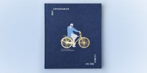
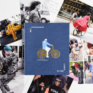
 BILL CUNNINGHAM: On the Street, published by Clarkson Potter, debuted as a New York Times bestseller earlier this month and represents the first published collection of photographs by the icon of street style, bringing together favorites published in The New York Times alongside never-before-seen work across five decades.
Bill Cunningham’s photography captured the evolution of style, of trends, and of the everyday, both in New York City and in Paris. This book’s photographs move from decade to decade, beginning in the 1970s and continuing until Cunningham’s death in 2016. In its pages, you’ll find Cunningham’s distinctive chronicling of many significant moments.
This enduring portfolio is enriched by essays that provide a revealing portrait of Cunningham and a few of his many fascinations and influences, contributed by Cathy Horyn, Tiina Loite, Vanessa Friedman, Ruth La Ferla, Guy Trebay, Penelope Green, Jacob Bernstein, and a much favored subject, Anna Wintour. More than anything, On the Street is a timeless representation of Cunningham’s commitment to capturing the here and now.
In this Behind the Pages interview, Clarkson Potter Executive Editor Amanda Englander opens up wonderful windows into what sparked the creation of this book, the editorial, design and production process involved, and how the book will resonate with readers everywhere.
What was the genesis of the BILL CUNNINGHAM: On the Street book project?
Bill Cunningham has long been a New York City icon and, more specifically, a Midtown mascot. When he passed away in June 2016, style reporter Jacob Bernstein wrote a beautiful obituary that ran in The New York Times, and the same day, fashion critic Vanessa Friedman followed it up with her own lovely tribute. This was followed by a slideshow of his work, more articles by Cathy Horyn and Sona Patel, and even letters to the editor. The outpouring of love shined a light on Bill and his work in a way that this modest, humble photographer might have hated. At the time, other than the 2010 documentary Bill Cunningham New York, he had rarely spoken publicly, preferring to remain in the background. But after Bill’s death and the subsequent attention, it only made sense to continue the important conversation he’d begun. A few months later, in January 2017, we began conversations with the Times with the immediate goal of publishing a beautiful and timely book to honor Bill for the work he was best known.
How would you describe the editorial and design process, and what was involved in the photo selection, narrative/captioning, and chapter ordering?
 Bill took pictures for The New York Times from 1978 up to the time of his death—but he wasn’t a full-time employee there until 1994, so many of the early photos belong to his estate. Bill was prolific and had a, shall we say, casual system of organization. If you saw the documentary, you know his filing cabinets were almost as famous as he was; they were moved out of his home and into a storage facility after his death. Senior art director Stephanie Huntwork and I had the truly unique privilege of visiting the cabinets in Rockland County, where we found them completely intact—plus boxes and boxes more. In each cabinet—only very loosely arranged by year, labeled on the outside with Post-it notes—sat an individual folder for every event Bill had been invited to attend. In those, we found photos that had been cut up with scissors to fit his allotted footprint in the newspaper, as well as larger, uncropped photos marked up with pencil, negatives, party invitations, dinner menus, and even phone message slips.
By the time we drove back to the city, we knew the book’s chapters had to be organized by decade. What’s super interesting (and I hadn’t realized) is that the Times didn’t start printing in color until 1997. So in organizing the book by decade, we were able to capture an awesome Wizard of Oz moment where the color starts creeping in, and then all of the sudden we are in Technicolor.
With so much art to wrangle, senior designer Jen Wang worked up early sample designs that we were able to use as a footprint for the book in its entirety. We could have filled volumes and volumes, but we needed to figure out a feasible length. What I love most about Jen’s design is how brilliantly she paid homage to Bill’s collage style from the newspaper, but also showed the art in a brand-new way, uncropping much of it and even running some of the most terrific photos as full pages or spreads.
Photo editor Tiina Loite came on board with the herculean task of wrangling Bill’s life’s work. She worked with Bill at the Times in the ’80s and early ’90s, so she was able to efficiently unearth materials in the newspaper’s archive that no one else would’ve been able to find. She also had a deep understanding of his thought process, and her insider knowledge was invaluable in combing through those cabinets.
With much back and forth, Jen and Tiina joined forces in selecting which photos made the cut; this is when we really decided to focus on Bill’s work for “On the Street,” and less so on his other column, “Evening Hours.” I wanted the book also to pay some tribute to the themes Bill often took on—a particular style, like menswear for women; a trend, like leopard print; or a particular accessory, like fabulous hats. Within each decade, some photos are arranged into these loose clusters. Other photos were matched together to contradict or highlight one another (check out pages 164 and 165 to see what I mean). Once the art was in place, Tiina and I decided together where we needed captions. When included, they comment on what might’ve caught Bill’s eye, how a particular trend related to current events at the time, and of course, any celebrities or socialites in the shot.
Several essays also appear throughout the book, contributed by fashion writers, each focusing on a different fascination of Bill, be that dogs, muses, or city-goers caught in the rain. Having started my publishing career as an intern in the fashion closet at Glamour magazine, it was wild to edit an essay written by Anna Wintour! (OK, I didn’t have that many notes for her. . . .)
Why is Clarkson Potter the best publishing home for this book?
At Clarkson Potter, we pride ourselves on how editorial, design, and production come together to publish in the illustrated lifestyle space, and we always focus on the reader. We knew this book would be as much for getting lost in the pages as it would be a treasured object to display. From the weight of the interior paper to the exact shade of blue the cloth cover is dyed, every decision was deliberate and exact. This book wouldn’t be what it is without my collaboration with Jen, as well as with senior production manager Philip Leung. Additionally, this may come as a shock, but Bill’s photography often wasn’t in the best shape. The Times didn’t go digital until 2011, and Bill was one of the last to succumb—until then, he had his film developed at a regular old camera store! Neil Spitkovsky and Zoe Tokushige ensured that the art in the book printed at the high quality readers expect.
In addition to those I’ve mentioned, the book benefitted from the careful work of senior production editor Patricia Shaw, director of marketing Windy Dorresteyn, associate directors of publicity Jana Branson and Michelle Jasmine, and so many other hands, too. I believe this book is the pinnacle of our strengths across all teams.
What aspects of BILL CUNNINGHAM: On the Street do you think will resonate most strongly with readers?
 This book is publishing at an interesting time—and perhaps at exactly the right time. “Street style” is part of the vernacular today in a way it never has been before. It seems obvious now that Bill Cunningham is the original street style photographer. But Bill never considered himself a fashion photographer; rather, he was genuinely fascinated by how people get dressed in order to feel good about themselves. A street fair, parade, or Wednesday afternoon thrilled him just as much as a runway show, gala, or exhibit opening. In capturing street style, Bill also captured moods and emotions. His photos don’t just chronicle how fashion trends changed; they chronicle important historical events, like the 1980s transit strike (commuters in sneakers!); the rise of 1990s casual Fridays (khakis!); the sadness that fell over the city following 9/11; the onset of selfies; and so on. In a way that I really don’t think you can find on Instagram, Bill showed that street style is about people and culture as much as it is about the outfits. Bill’s legacy, ultimately, is a portrait of the everyday in the late 20th and early 21st centuries. And no matter how you like to dress or what you like to wear, you will be able to find a bit of yourself in this book.


