Alceu Nunes, Art Director at Companhia das Letras Group
;void(0);)
 I’ve been the Art Director at Companhia das Letras Group at PRH Brasil for about ten years. I coordinate a team of five designers responsible for making book covers and, in some cases, the page layout. We work with freelance collaborators to help us create an average of 40 books per month.
We do all the revision processes to send the book to print. Additionally, we take care of the group’s visual identity and advise other departments on design-related questions.
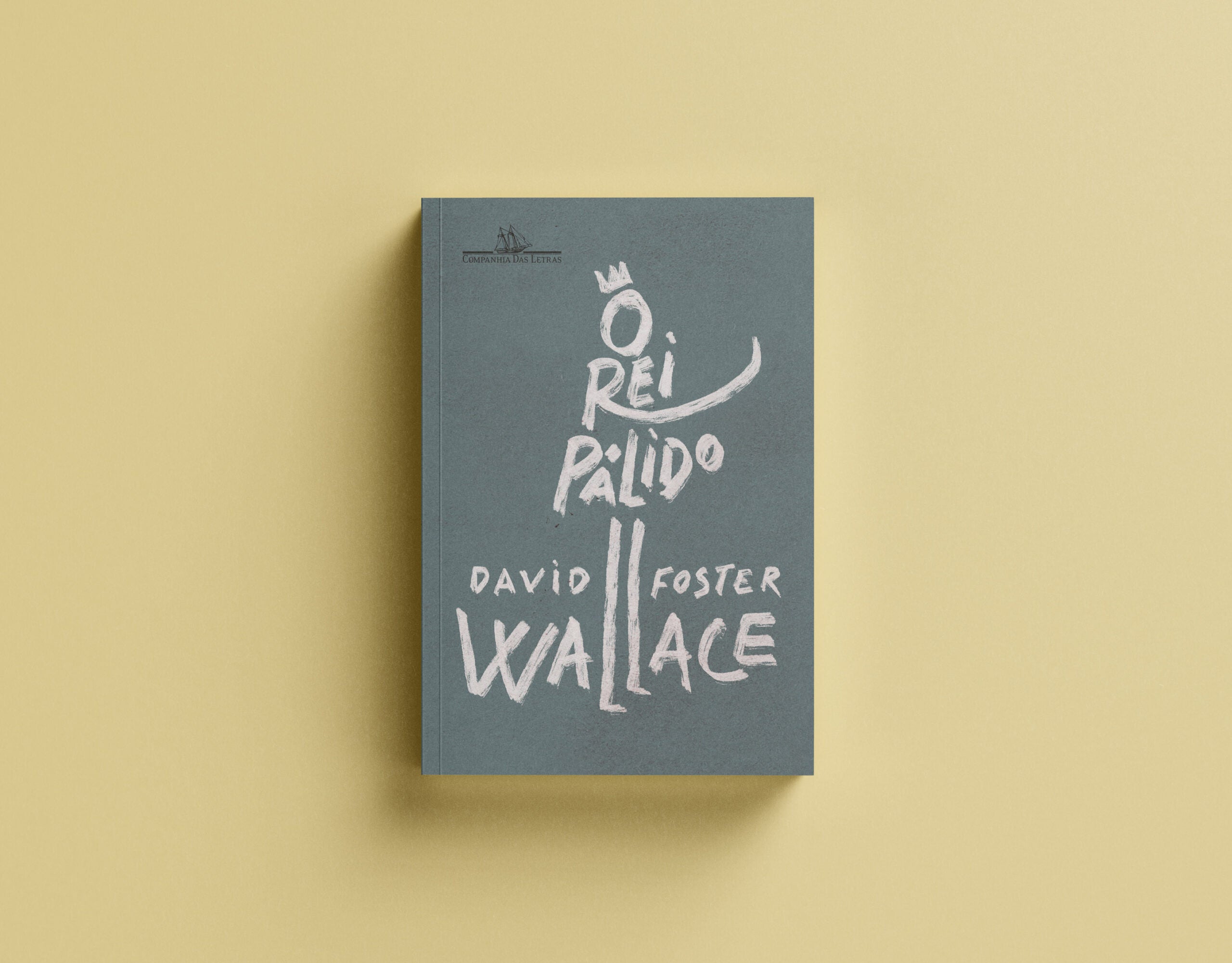
On average, I design 30 covers annually. This year, however, I beat my record and made about 50 covers. One of the covers I most enjoyed creating was for the book THE PALE KING by David Foster Wallace. Unfortunately, the author passed away before finishing the book. The drafts for this manuscript were found in the author’s house. The pages were out of order, and the writings were distributed in different places, such as on paper and computers. So, at first, the editor was skeptical that producing a book would actually be possible. But in the end, he could put everything together and edit the book.
When I started, I tried working with different typographies to create an all-type cover. But since the book was unfinished and its draft was found in the author’s house, I thought of working with gestural lettering as if it were a study for a cover. Little by little, while studying the possibilities of gestural lettering, the king’s outline appeared on the title’s words in Portuguese. “O rei pálido” O = the, like the head of the king. Rei = king, the Chester, and the arm. Pálido = pale, the body, and to finish, the legs appearing from the double “ll” came from the author’s surname, Wallace.