Behind the Book Covers with Berkley’s Colleen Reinhart
December 4, 2017
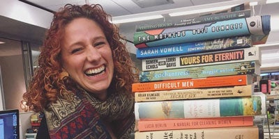 Our latest Behind the Book Covers feature presents Colleen Reinhart, Senior Designer at Berkley. She has worked at Penguin Random House for more than four years, designing dozens of covers along the way. Colleen brings an imaginative, original, and striking style to the design process, resulting in unique, colorful and sometimes playful creations that connect with and visually engage readers. Read on to learn about her creative design world and view a selection of her wonderful covers.
 ![]()

 Once I realized that book cover design was a job it became a no-brainer. I love books and art so it only made sense to combine the two. I interned with the Berkley design team during my senior year at Parsons and have managed to stick around since then.
How would you describe the conceptual processes you follow when envisioning then creating a book cover?
Once I realized that book cover design was a job it became a no-brainer. I love books and art so it only made sense to combine the two. I interned with the Berkley design team during my senior year at Parsons and have managed to stick around since then.
How would you describe the conceptual processes you follow when envisioning then creating a book cover?
 It really depends on the project, sometimes when the editor is describing the book in our meeting I can picture exactly what I would want the cover to look like in my head. Other times I find myself working on a title that covers material less familiar to me, like the book, THE SPY WHO COULDN’T SPELL, which is about the FBI attempting to break a code from a government informant. Safe to say I don’t have any expertise in this area, so reading up on the case and looking at images of the code helped me conceptualize the cover.
 Which of your book cover designs are your most proud of and why?
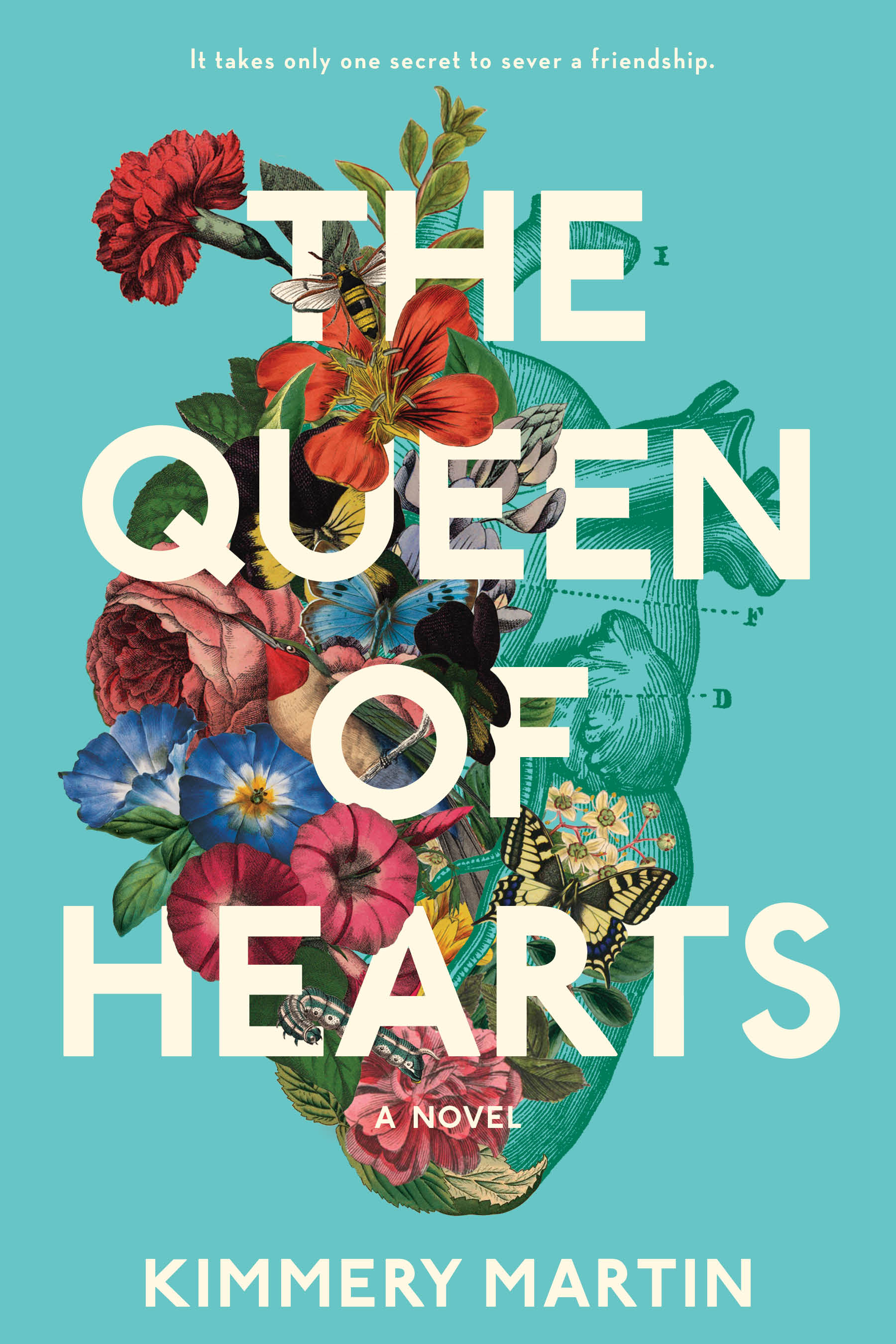
I feel like this answer changes depending on when I am asked since I am usually most excited about whatever I am working on. Right now, I am proud of the cover for THE KISS QUOTIENT. A lot of the romance books that would have gotten a more photographic treatment in the past are moving towards fun illustrated covers and I think this style really captures the feeling of this story.
How has the evolution of digital technology impacted your craft?
Which of your book cover designs are your most proud of and why?
I feel like this answer changes depending on when I am asked since I am usually most excited about whatever I am working on. Right now, I am proud of the cover for THE KISS QUOTIENT. A lot of the romance books that would have gotten a more photographic treatment in the past are moving towards fun illustrated covers and I think this style really captures the feeling of this story.
How has the evolution of digital technology impacted your craft?

 This is a difficult question to answer since as long as I have been working in design Photoshop and InDesign have been around. In terms of how to use technology to sell books, the majority of people buying books online means that the thumbnail of a cover is almost as important as the full-scale image. More and more we want something that is visually interesting and easily identifiable at a smaller scale.
Behind the Book Covers with Riverhead's Grace Han
July 27, 2017
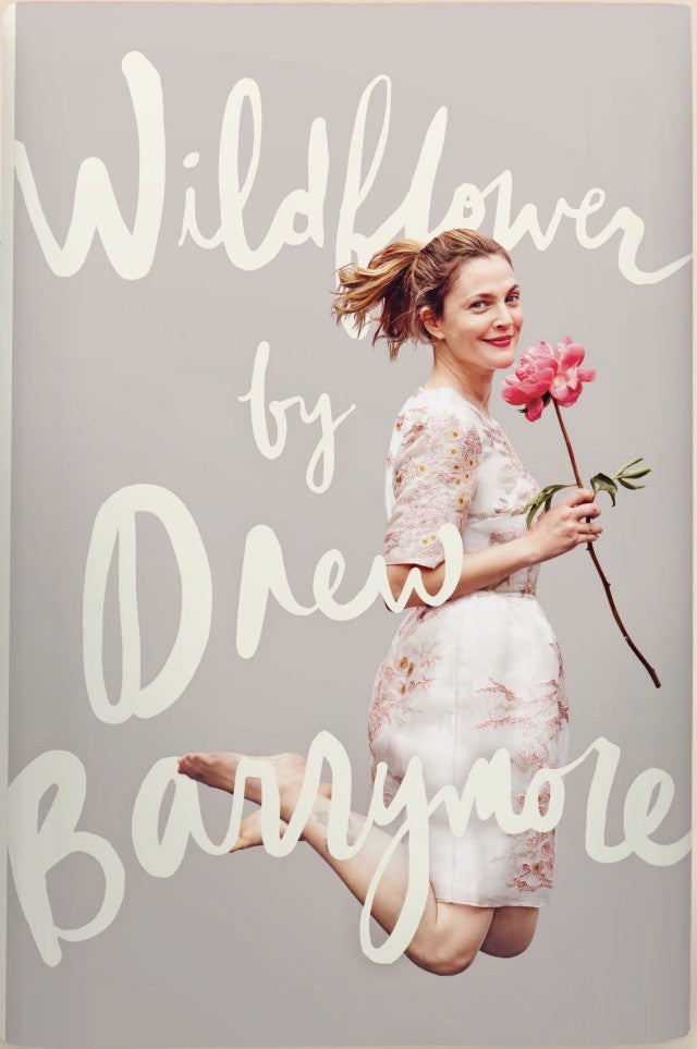
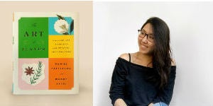 Grace Han, Senior Designer for Riverhead Books, has worked at Penguin Random House for nearly four years, designing covers for a wide range of titles, everything from cookbooks (THE ART OF FLAVOR) to Drew Barrymore’s memoir (WILDFLOWER). Her covers are simple, elegant, and beautiful. We’re thrilled to feature Grace in our Beyond the Book Covers series.
 What initially drew you to the world of book cover art design?
I studied graphic design and motion graphics at the School of Visual Arts. During my last year, a good amount of my thesis project ended up being book covers. I think my love for reading and design converged. Once I realized there was a career in designing book covers, I knew that’s what I wanted to do. Not long after graduation, I was lucky enough to be hired by Riverhead Books.
H
What initially drew you to the world of book cover art design?
I studied graphic design and motion graphics at the School of Visual Arts. During my last year, a good amount of my thesis project ended up being book covers. I think my love for reading and design converged. Once I realized there was a career in designing book covers, I knew that’s what I wanted to do. Not long after graduation, I was lucky enough to be hired by Riverhead Books.
H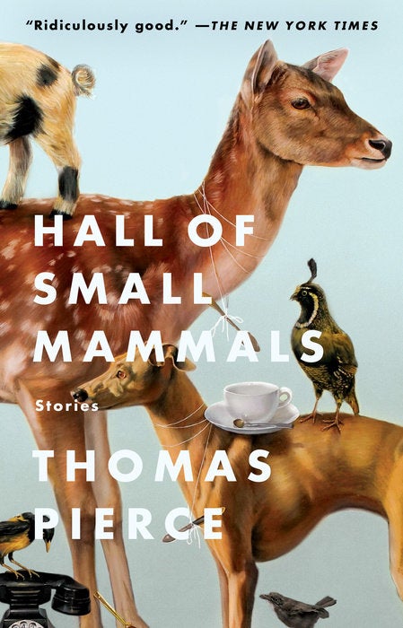 ow would you describe how you work when conceptualizing and then creating cover designs?
It’s different for every book, but I usually enjoy writing down concepts and visuals, sketching while reading the content I’m designing for. Then I play with ideas on paper or on the computer. When you play enough, ideas will work themselves out.
Sometimes, all it takes is a great piece of art or typeface so I spend a good amount of time researching images, artists, and type designers. For HALL OF SMALL MAMMALS, I was able to work with Kate Bergin whose work is so wonderfully quirky–perfect for Thomas Pierce’s writing. It’s great getting to fully craft a cover by myself, but it’s also really exciting to be able to work with other creatives.
ow would you describe how you work when conceptualizing and then creating cover designs?
It’s different for every book, but I usually enjoy writing down concepts and visuals, sketching while reading the content I’m designing for. Then I play with ideas on paper or on the computer. When you play enough, ideas will work themselves out.
Sometimes, all it takes is a great piece of art or typeface so I spend a good amount of time researching images, artists, and type designers. For HALL OF SMALL MAMMALS, I was able to work with Kate Bergin whose work is so wonderfully quirky–perfect for Thomas Pierce’s writing. It’s great getting to fully craft a cover by myself, but it’s also really exciting to be able to work with other creatives.
 Which of the book covers that you designed are you proudest of and why?
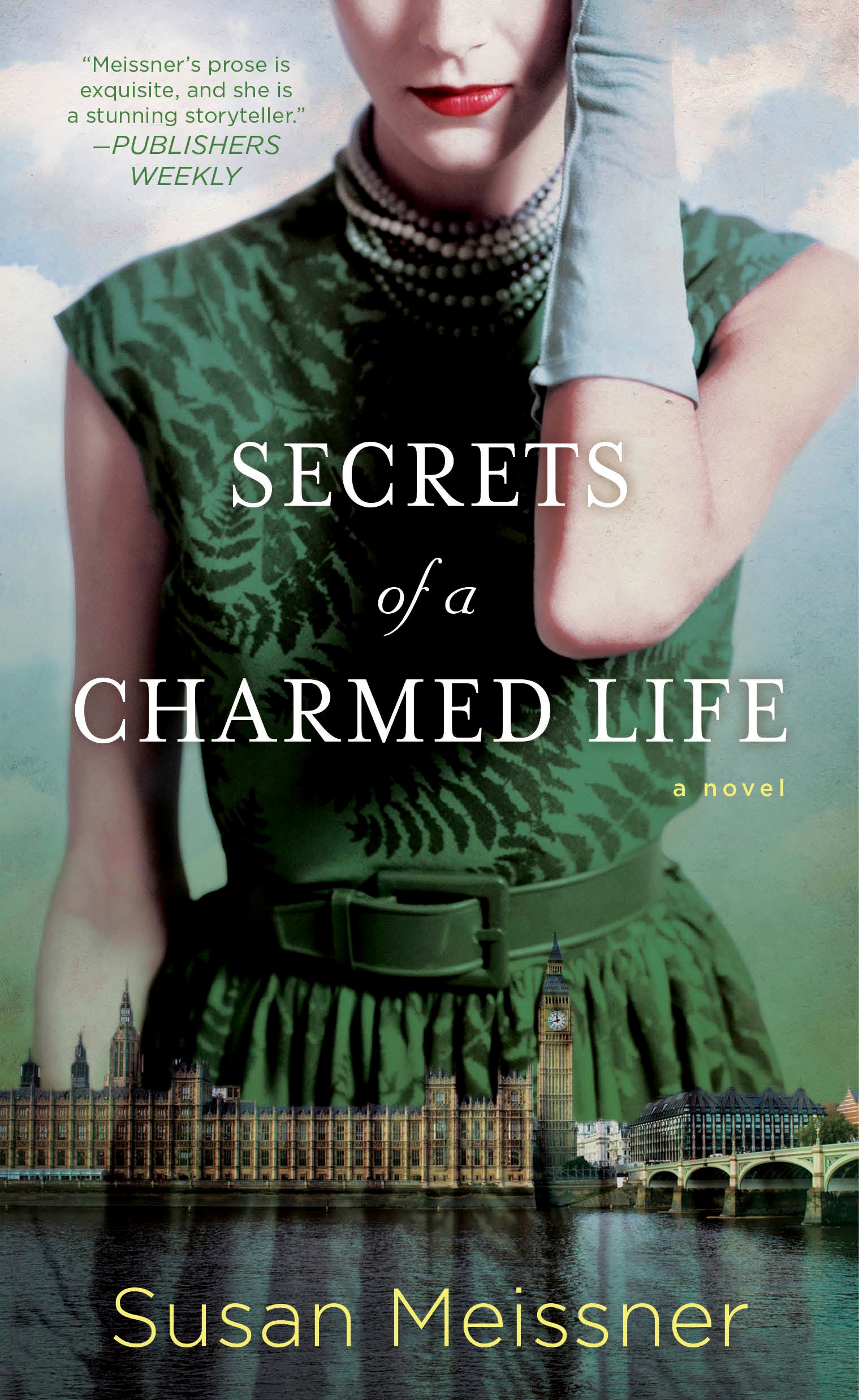
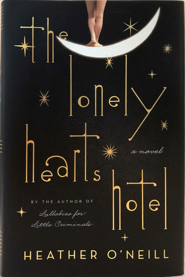
I loved working on THE LONELY HEARTS HOTEL, especially because I enjoy Heather O'Neill’s writing. The book is dark, sexy, and beautifully tragic. For the final cover, I came across a photo of a woman on the moon which felt romantic and sad. The font Futuracha, created by Høly, a creative studio in Athens, Greece, added just the right amount of eccentricity. It took a lot of drafts to get to the final, but I was able to explore many directions and learn a great deal in the process.
Which of the book covers that you designed are you proudest of and why?
I loved working on THE LONELY HEARTS HOTEL, especially because I enjoy Heather O'Neill’s writing. The book is dark, sexy, and beautifully tragic. For the final cover, I came across a photo of a woman on the moon which felt romantic and sad. The font Futuracha, created by Høly, a creative studio in Athens, Greece, added just the right amount of eccentricity. It took a lot of drafts to get to the final, but I was able to explore many directions and learn a great deal in the process.
 Where do you see the future of book design going and how do you envision the evolution of your craft?
I think book design will need to continue to be creative and push boundaries. I believe people will continue to appreciate books as a tangible object. But books will need to be a covetable item while still being able to stand out as a thumbnail in the digital world. I enjoy working at PRH because I feel like we are aiming to do just that.
You can view more of Grace's work here.
Where do you see the future of book design going and how do you envision the evolution of your craft?
I think book design will need to continue to be creative and push boundaries. I believe people will continue to appreciate books as a tangible object. But books will need to be a covetable item while still being able to stand out as a thumbnail in the digital world. I enjoy working at PRH because I feel like we are aiming to do just that.
You can view more of Grace's work here. Behind the Book Covers with Penguin Young Readers’ Jason Henry
October 17, 2016
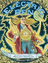
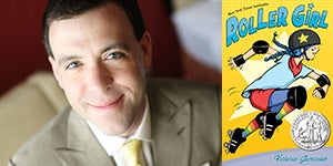 Jason Henry, Senior Designer, Dial Books for Young Readers, has more than fifteen years of experience designing books for young readers and is featured in our Behind the Book Covers series. Jason has won awards for his work from the Book Industry Guild of New York, as well as receiving a 2013 Sibert Honor picture book for ELECTRIC BEN: The Amazing Life and Times of Benjamin Franklin and a 2016 Newbery Honor book for ROLLER GIRL. Many of the
 I very quickly fell in love with the art of creating picture books and knew that’s what I wanted to do. Bert Waggott was the Design professor who introduced me to the art of typography and graphic design. I loved working with type and learning from him what went into making beautiful books. One day, he asked if I’d be interested in applying for an internship at Dial Books for Young Readers, where his friend Nancy Leo-Kelly worked as a designer. I jumped at the chance, got the internship, and began working with art director Atha Tehon, and the Dial art department. It was an amazing experience, and after graduation I started with Penguin Young Readers full time—where I am today, doing what I love.
What has made this job so exciting for me over the years is the passion of the talented people I work with, the beautiful books that we have the opportunity to create, and the readers that we get to reach and inspire through these books—the same way the books I read as a kid inspired me.
How would you describe the conceptual processes you follow when envisioning then creating a book cover?
One of the things that I love about my work is that we get to create projects across such a wide range of formats—from Board-Books to Graphic Novels, from Picture Books to illustrated Middle-Grade and Young Adult. Even though each of these are very different, a similarity is that the process of designing the cover is a collaborative one. I work with the illustrator, editor, publisher, executive art director, and others early on in the process and begin sketching out thoughts for the cover image, designing the title-type, or playing with the composition and layout of a sketch the illustrator has sent me. Those ideas for the cover come from the story and what we can pull from it in terms of setting, character, or mood, and also how the entire design of the book can tie together as a cohesive package. After designing a variety of layouts, we get together and “kick-the-tires” to see what’s working and what’s not—and then go back and rework until we’ve hit on the final cover. I think the back-and-forth conversation that happens around the cover design is what ends up making the final version great. And when the cover’s great, it can be what brings readers to their next favorite book.
I very quickly fell in love with the art of creating picture books and knew that’s what I wanted to do. Bert Waggott was the Design professor who introduced me to the art of typography and graphic design. I loved working with type and learning from him what went into making beautiful books. One day, he asked if I’d be interested in applying for an internship at Dial Books for Young Readers, where his friend Nancy Leo-Kelly worked as a designer. I jumped at the chance, got the internship, and began working with art director Atha Tehon, and the Dial art department. It was an amazing experience, and after graduation I started with Penguin Young Readers full time—where I am today, doing what I love.
What has made this job so exciting for me over the years is the passion of the talented people I work with, the beautiful books that we have the opportunity to create, and the readers that we get to reach and inspire through these books—the same way the books I read as a kid inspired me.
How would you describe the conceptual processes you follow when envisioning then creating a book cover?
One of the things that I love about my work is that we get to create projects across such a wide range of formats—from Board-Books to Graphic Novels, from Picture Books to illustrated Middle-Grade and Young Adult. Even though each of these are very different, a similarity is that the process of designing the cover is a collaborative one. I work with the illustrator, editor, publisher, executive art director, and others early on in the process and begin sketching out thoughts for the cover image, designing the title-type, or playing with the composition and layout of a sketch the illustrator has sent me. Those ideas for the cover come from the story and what we can pull from it in terms of setting, character, or mood, and also how the entire design of the book can tie together as a cohesive package. After designing a variety of layouts, we get together and “kick-the-tires” to see what’s working and what’s not—and then go back and rework until we’ve hit on the final cover. I think the back-and-forth conversation that happens around the cover design is what ends up making the final version great. And when the cover’s great, it can be what brings readers to their next favorite book.
 Which of your book cover designs are you most proud of and why?
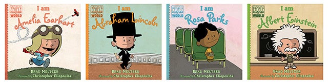
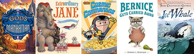
It’s tough to pick just a few books to share because I do put much thought and care into the design of each one, and am fortunate to be a part of making such incredible titles. One series that I particularly love designing is Brad Meltzer and Chris Eliopoulos’ bestselling ORDINARY PEOPLE CHANGE THE WORLD. With twelve titles and counting, I’m proud of how each cover stands well on its own and looks great as a collection too—each has so much heart.
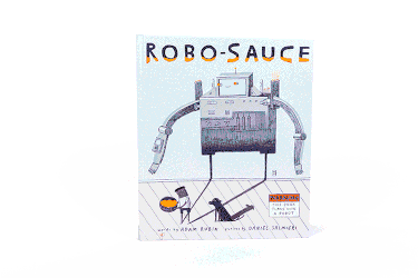
Another title that I’m proud of designing is the picture book, ROBO-SAUCE. This was a tour de force to produce. The challenge that the author gave me was to find a way to create a book that would transform into a completely new book—with its own alternate cover—as the result of something awesome that happens in the story. And, the way it needed to work had to be simple and easy enough for a child or a parent to do as they read the story. I worked on many variations to engineer the final fold-out-and-wrap-around silver foil and neon-orange jacket that creates the transformation of ROBO-SAUCE to ROBO-BOOK. The end result was something totally original and exciting to discover inside the book.
I’m also very proud of the design of the Newbery Honor-winning Roller Girl. When designing the cover, I took inspiration from the look of colorful roller-derby posters. The cover is impactful, fun, and I’m happy at how this title has reached so many readers.
Which of your book cover designs are you most proud of and why?
It’s tough to pick just a few books to share because I do put much thought and care into the design of each one, and am fortunate to be a part of making such incredible titles. One series that I particularly love designing is Brad Meltzer and Chris Eliopoulos’ bestselling ORDINARY PEOPLE CHANGE THE WORLD. With twelve titles and counting, I’m proud of how each cover stands well on its own and looks great as a collection too—each has so much heart.
Another title that I’m proud of designing is the picture book, ROBO-SAUCE. This was a tour de force to produce. The challenge that the author gave me was to find a way to create a book that would transform into a completely new book—with its own alternate cover—as the result of something awesome that happens in the story. And, the way it needed to work had to be simple and easy enough for a child or a parent to do as they read the story. I worked on many variations to engineer the final fold-out-and-wrap-around silver foil and neon-orange jacket that creates the transformation of ROBO-SAUCE to ROBO-BOOK. The end result was something totally original and exciting to discover inside the book.
I’m also very proud of the design of the Newbery Honor-winning Roller Girl. When designing the cover, I took inspiration from the look of colorful roller-derby posters. The cover is impactful, fun, and I’m happy at how this title has reached so many readers.
 What role do you think its cover plays in attracting a young reader or parent to a book?
The cover is really our first impression of a book, and it’s my goal to make it welcoming and intriguing for a young reader or parent to pick up and discover the story within. When designing a book, I put much time and care not only into the layout, but also to the physical aspects of the book. The great thing about a book is that picking it up and reading it is a tactile experience (and in the case of picture books, something that’s often going to be shared between a parent and a child). So, the trim size of the book, number of pages, the type of paper used on the interior and jacket, and any effects that we may employ on the cover (like foil, neon inks, embossing, different types of lamination, and more) are all deliberate choices that I can make to enhance the experience of reading the book, and make it memorable.
What role do you think its cover plays in attracting a young reader or parent to a book?
The cover is really our first impression of a book, and it’s my goal to make it welcoming and intriguing for a young reader or parent to pick up and discover the story within. When designing a book, I put much time and care not only into the layout, but also to the physical aspects of the book. The great thing about a book is that picking it up and reading it is a tactile experience (and in the case of picture books, something that’s often going to be shared between a parent and a child). So, the trim size of the book, number of pages, the type of paper used on the interior and jacket, and any effects that we may employ on the cover (like foil, neon inks, embossing, different types of lamination, and more) are all deliberate choices that I can make to enhance the experience of reading the book, and make it memorable.
 What was the inspiration behind the creation of Books Beyond Borders?
Books Beyond Borders was created through a conversation I had with a friend who has done outreach work in Africa. She told me about the children that she worked with in Nigeria who were in need of something that I took for granted—books and paper. I was moved, and chose to help. Through conversations with friends, coworkers, and family, I was able to gather an abundance of books to donate. I found the more people I talked to, the more books came my way, and also more individuals willing to help. I also saw that there was just as much need here at home as there was at my friend’s school in Africa. Since February 2016, this community project has gathered and donated over 1,000 books locally and in multiple countries—Kenya, Nepal, and South Africa. What’s next for the project is a program to teach children how to create their own books from simple materials, and share those stories with each other around the world.
The books that I read as a kid transported me to places I could only dream of being, and opened the doors to a love of art and learning, which in turn lead to my career in publishing. That’s something that I am honored to be a part of creating for others through the books we make together.
What was the inspiration behind the creation of Books Beyond Borders?
Books Beyond Borders was created through a conversation I had with a friend who has done outreach work in Africa. She told me about the children that she worked with in Nigeria who were in need of something that I took for granted—books and paper. I was moved, and chose to help. Through conversations with friends, coworkers, and family, I was able to gather an abundance of books to donate. I found the more people I talked to, the more books came my way, and also more individuals willing to help. I also saw that there was just as much need here at home as there was at my friend’s school in Africa. Since February 2016, this community project has gathered and donated over 1,000 books locally and in multiple countries—Kenya, Nepal, and South Africa. What’s next for the project is a program to teach children how to create their own books from simple materials, and share those stories with each other around the world.
The books that I read as a kid transported me to places I could only dream of being, and opened the doors to a love of art and learning, which in turn lead to my career in publishing. That’s something that I am honored to be a part of creating for others through the books we make together.